

Be Our Guests
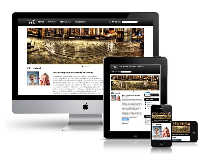
Hi Everyone! We would like to welcome you to the upgraded CTL website. “What’s new? It all looks the same.” you may ask. This is a complete overhaul of the website to a better, more mobile friendly design. That’s right! Pull this website up on your smart phone, tablet, or simply resize this very window and get a customized version of the site targeted specifically to that device. This is accomplished through the magic of a technique called responsive web design. Responsive means that the design will automatically respond to any screen size by adjusting itself accordingly. As with any website overhaul there are always bugs that appear through the course of others using the site so please feel free to contact James Bowles with issues with this site you may be experiencing or any general feedback on the site. Special thanks goes to 1140px CSS Grid for providing the system for the responsive design and to Andrew Kasian for tirelessly providing iPhone UI testing and feedback. Enjoy!
-The CTL